
This article is part of our The Saber's Edge series.
While owners might think the top players are the safest options, they aren't. Stars are the riskiest. Additionally, players with perceived risk provide the most future value because they have the chance to add playing time.
I wish I could just jump to the conclusions, which are simple to understand, but I need to run some calculations to back up the results. For my analysis, I will use 2010 to 2016 Steamer projections and find the actual results. To standardize the hitter values, I used 5-category (AVG, not OBP), 12-team SDP values from the 2015 NFBC season. Using a single equation allows all the stats to be combined into pre- and post-projection values spanning several seasons.
If I have any trepidation, it is with using the same equation for all league sizes. But it shouldn't matter as I am examining how expected values deviate from projections. The single formula should have component values close enough for the years examined.
Additionally, I am going to assume no position inflation for catchers or shortstops. While it might be interesting to see how position projections differ, I will limit the research to the top projected players regardless of position.
Finally, I combined the hitters into twenty 90-player groups by their expected production to compare to their actual production.
Like last week, I found the results starting
While owners might think the top players are the safest options, they aren't. Stars are the riskiest. Additionally, players with perceived risk provide the most future value because they have the chance to add playing time.
I wish I could just jump to the conclusions, which are simple to understand, but I need to run some calculations to back up the results. For my analysis, I will use 2010 to 2016 Steamer projections and find the actual results. To standardize the hitter values, I used 5-category (AVG, not OBP), 12-team SDP values from the 2015 NFBC season. Using a single equation allows all the stats to be combined into pre- and post-projection values spanning several seasons.
If I have any trepidation, it is with using the same equation for all league sizes. But it shouldn't matter as I am examining how expected values deviate from projections. The single formula should have component values close enough for the years examined.
Additionally, I am going to assume no position inflation for catchers or shortstops. While it might be interesting to see how position projections differ, I will limit the research to the top projected players regardless of position.
Finally, I combined the hitters into twenty 90-player groups by their expected production to compare to their actual production.
Like last week, I found the results starting at the top 10 percent. Then, I move down to the 25, 50, 75 and 90 percent ranks. Additionally, I included the median number of projected and actual plate appearances. Here are the results.
| TOP PROJ. HITTERS | 10% | 25% | 50% | 75% | 90% | PROJ. SGP | ACTUAL SGP | DIFF | Std Dev SGP | PROJ. PA | ACTUAL PA | DIFF | Std Dev SGP |
| 1 - 90 | 3.2 | 0.2 | -2.5 | -5.5 | -9.7 | 15.2 | 12.7 | -2.5 | 5.3 | 673 | 642 | -32 | 5.3 |
| 91 - 180 | 3.4 | 0.8 | -1.3 | -5.0 | -8.2 | 13.0 | 11.6 | -1.4 | 4.7 | 648 | 635 | -13 | 4.7 |
| 181 - 270 | 2.9 | 0.5 | -1.1 | -4.4 | -7.4 | 11.6 | 10.4 | -1.2 | 3.8 | 635 | 625 | -10 | 3.8 |
| 271 - 360 | 4.0 | 1.2 | -1.7 | -4.8 | -7.9 | 10.7 | 8.8 | -2.0 | 4.5 | 623 | 606 | -17 | 4.5 |
| 361 - 450 | 4.9 | 1.9 | -0.2 | -3.6 | -8.1 | 10.1 | 9.7 | -0.4 | 4.5 | 613 | 612 | -2 | 4.5 |
| 451 - 540 | 3.7 | 1.6 | -1.9 | -5.1 | -7.9 | 9.4 | 7.5 | -2.0 | 4.3 | 599 | 565 | -35 | 4.3 |
| 541 - 630 | 3.9 | 2.6 | -1.1 | -5.3 | -9.0 | 9.0 | 8.0 | -1.1 | 4.9 | 586 | 579 | -7 | 4.9 |
| 631 - 720 | 3.2 | 0.4 | -1.5 | -4.4 | -6.8 | 8.6 | 7.0 | -1.6 | 3.8 | 590 | 554 | -36 | 3.8 |
| 721 - 810 | 3.9 | 2.0 | -1.0 | -3.0 | -6.1 | 8.0 | 7.1 | -0.9 | 3.8 | 575 | 575 | 0 | 3.8 |
| 811 - 900 | 3.9 | 1.6 | -1.8 | -4.4 | -6.9 | 7.5 | 5.7 | -1.8 | 4.5 | 561 | 558 | -3 | 4.5 |
| 901 - 990 | 4.7 | 1.8 | -0.4 | -4.4 | -7.2 | 7.1 | 6.5 | -0.6 | 4.4 | 542 | 506 | -36 | 4.4 |
| 991 - 1080 | 3.2 | 0.7 | -1.7 | -3.7 | -6.1 | 6.7 | 5.1 | -1.6 | 3.6 | 539 | 476 | -63 | 3.6 |
| 1081 - 1170 | 3.0 | 0.6 | -1.8 | -5.2 | -8.2 | 6.1 | 4.5 | -1.6 | 4.4 | 518 | 459 | -59 | 4.4 |
| 1171 - 1260 | 3.9 | 1.8 | -1.2 | -4.2 | -6.5 | 5.8 | 4.7 | -1.1 | 4.3 | 501 | 451 | -50 | 4.3 |
| 1261 - 1350 | 4.6 | 1.4 | -1.0 | -3.2 | -4.4 | 5.4 | 4.3 | -1.1 | 3.4 | 483 | 470 | -13 | 3.4 |
| 1351 - 1440 | 3.7 | 1.5 | -1.8 | -4.1 | -6.2 | 4.9 | 3.1 | -1.8 | 3.8 | 464 | 439 | -25 | 3.8 |
| 1441 - 1530 | 4.2 | 1.7 | -1.8 | -4.7 | -6.0 | 4.4 | 2.7 | -1.7 | 4.1 | 446 | 388 | -58 | 4.1 |
| 1531 - 1620 | 4.1 | 1.7 | -0.8 | -3.7 | -5.4 | 3.9 | 3.1 | -0.8 | 4.2 | 425 | 362 | -63 | 4.2 |
| 1621 - 1710 | 3.7 | 1.8 | -0.9 | -3.7 | -5.6 | 3.3 | 2.5 | -0.8 | 3.5 | 398 | 368 | -30 | 3.5 |
| 1711 - 1800 | 4.1 | 1.9 | -0.5 | -2.9 | -4.9 | 2.8 | 2.2 | -0.6 | 3.5 | 367 | 344 | -23 | 3.5 |
| Average | 3.8 | 1.4 | -1.3 | -4.3 | -6.9 | 7.7 | 6.4 | -1.3 | 4.2 | 539 | 511 | -29 | 4.2 |
The table contains a lot of data that lacks any noticeable trends. Besides the "1-90" group, almost all the group values hover around the overall averages. After analyzing the data too long, I have come to one conclusion: "The bigger they are, the harder they fall." The top players just have a larger floor because of lost playing time, mainly from injuries. They concept can be visualized with this image.
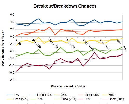
The trend shows the 10 and 25 percent breakouts are relatively linear. All projected players show the same chances of breaking out. Moving to the 75 and 90 percent performance lines, the drop-offs are larger for the higher projections.
Let this sink in: the better hitter, the riskier he is. It's not just the top handful of players providing injury risk, but the risk spread out among all the players. Mike Trout and Alcides Escobar have the same injury chances, and trying to figure out which is the bigger risk is almost impossible.
Time to move on and examine the data differently. Instead of grouping by projections, I grouped the hitters by actual minus expected results.
| HITTERS | PROJ. SGP | ACTUAL SGP | DIFF | PROJ. PA | ACTUAL PA | DIFF |
| 1 - 90 | 7.0 | 14.1 | 7.1 | 533 | 644 | 111 |
| 91 - 180 | 7.6 | 12.0 | 4.4 | 546 | 639 | 93 |
| 181 - 270 | 7.7 | 10.9 | 3.2 | 558 | 614 | 56 |
| 271 - 360 | 7.3 | 9.6 | 2.4 | 555 | 605 | 50 |
| 361 - 450 | 6.5 | 8.2 | 1.7 | 540 | 583 | 43 |
| 451 - 540 | 7.4 | 8.4 | 1.0 | 560 | 588 | 28 |
| 541 - 630 | 7.2 | 7.7 | 0.5 | 558 | 586 | 28 |
| 631 - 720 | 7.2 | 7.1 | -0.2 | 561 | 559 | -2 |
| 721 - 810 | 7.4 | 6.7 | -0.7 | 550 | 548 | -2 |
| 811 - 900 | 6.8 | 5.8 | -1.0 | 546 | 531 | -15 |
| 901 - 990 | 7.9 | 6.4 | -1.5 | 568 | 530 | -38 |
| 991 - 1080 | 6.7 | 4.7 | -2.0 | 540 | 497 | -43 |
| 1081 - 1170 | 7.2 | 4.5 | -2.7 | 548 | 481 | -67 |
| 1171 - 1260 | 7.4 | 4.1 | -3.3 | 563 | 453 | -110 |
| 1261 - 1350 | 6.6 | 2.6 | -4.0 | 553 | 398 | -155 |
| 1351 - 1440 | 6.4 | 1.7 | -4.7 | 523 | 320 | -203 |
| 1441 - 1530 | 7.1 | 1.4 | -5.7 | 539 | 334 | -205 |
| 1531 - 1620 | 7.9 | 1.6 | -6.4 | 564 | 303 | -262 |
| 1621 - 1710 | 7.3 | -0.6 | -7.9 | 562 | 213 | -349 |
| 1711 - 1800 | 9.3 | -0.5 | -9.8 | 592 | 217 | -376 |
| Average | 7.3 | 5.8 | -1.5 | 553 | 482 | -71 |
I'll start with the top three groups. These players are desirable. They are the ones with the biggest improvements. These groups had projected plate appearances near or less than the average. They had room to play more. Also, they are productive players who achieved more playing time mainly because of season-long health or being rookie callup.
For reference, here are the top-30 players whose results were more than their projections.
| PLAYER | YEAR | PA | R | HR | RBI | SB | AVG | PROJ. SGP | PA | R | HR | RBI | SB | AVG | ACTUAL SGP | DIFF |
| Mike Trout | 2012 | 390 | 51 | 9 | 38 | 20 | .254 | 5.8 | 639 | 129 | 30 | 83 | 49 | .326 | 22.2 | 16.4 |
| Jose Bautista | 2010 | 410 | 50 | 13 | 45 | 3 | .240 | 4.0 | 683 | 109 | 54 | 124 | 9 | .260 | 18.3 | 14.4 |
| Jonathan Villar | 2016 | 320 | 32 | 7 | 30 | 20 | .238 | 3.7 | 679 | 92 | 19 | 63 | 62 | .285 | 17.8 | 14.2 |
| A.J. Pollock | 2015 | 523 | 55 | 9 | 46 | 15 | .260 | 6.0 | 673 | 111 | 20 | 76 | 39 | .315 | 17.9 | 11.9 |
| Chris Davis | 2013 | 456 | 58 | 23 | 67 | 2 | .264 | 7.4 | 673 | 103 | 53 | 138 | 4 | .286 | 19.0 | 11.6 |
| Jean Segura | 2016 | 507 | 50 | 7 | 44 | 20 | .270 | 6.2 | 694 | 102 | 20 | 64 | 33 | .319 | 16.2 | 1.0 |
| Michael Brantley | 2014 | 559 | 61 | 8 | 55 | 13 | .272 | 6.8 | 676 | 94 | 20 | 97 | 23 | .327 | 16.4 | 9.6 |
| Curtis Granderson | 2011 | 601 | 86 | 23 | 76 | 12 | .256 | 1.5 | 691 | 136 | 41 | 119 | 25 | .262 | 2.1 | 9.5 |
| Anthony Rendon | 2014 | 507 | 55 | 11 | 52 | 3 | .264 | 5.0 | 683 | 111 | 21 | 83 | 17 | .287 | 14.1 | 9.1 |
| Matt Kemp | 2011 | 687 | 85 | 26 | 105 | 23 | .275 | 14.8 | 689 | 115 | 39 | 126 | 40 | .324 | 23.8 | 9.0 |
| Bryce Harper | 2012 | 275 | 30 | 8 | 30 | 9 | .259 | 2.6 | 597 | 98 | 22 | 59 | 18 | .270 | 11.6 | 8.9 |
| Angel Pagan | 2010 | 344 | 37 | 6 | 39 | 14 | .272 | 4.3 | 633 | 80 | 11 | 69 | 37 | .290 | 13.1 | 8.8 |
| Adam Duvall | 2016 | 293 | 33 | 15 | 42 | 2 | .244 | 3.1 | 608 | 85 | 33 | 103 | 6 | .241 | 11.8 | 8.7 |
| Chase Headley | 2012 | 633 | 74 | 12 | 54 | 12 | .266 | 7.6 | 699 | 95 | 31 | 115 | 17 | .286 | 16.2 | 8.6 |
| Matt Carpenter | 2013 | 457 | 51 | 9 | 51 | 3 | .268 | 4.4 | 717 | 126 | 11 | 78 | 3 | .318 | 12.8 | 8.4 |
| Andres Torres | 2010 | 339 | 34 | 7 | 34 | 11 | .239 | 2.8 | 570 | 84 | 16 | 63 | 26 | .268 | 11.2 | 8.4 |
| Manny Machado | 2015 | 557 | 67 | 17 | 64 | 6 | .273 | 7.7 | 713 | 102 | 35 | 86 | 20 | .286 | 16.1 | 8.3 |
| Edwin Encarnacion | 2012 | 551 | 72 | 21 | 73 | 5 | .258 | 8.4 | 644 | 93 | 42 | 110 | 13 | .280 | 16.4 | 8.0 |
| Marlon Byrd | 2013 | 353 | 41 | 7 | 42 | 2 | .254 | 2.7 | 579 | 75 | 24 | 88 | 2 | .291 | 1.7 | 8.0 |
| Josh Donaldson | 2015 | 618 | 81 | 26 | 87 | 5 | .265 | 1.6 | 711 | 122 | 41 | 123 | 6 | .297 | 18.5 | 7.8 |
| Bryce Harper | 2015 | 560 | 74 | 23 | 76 | 9 | .279 | 1.4 | 654 | 118 | 42 | 99 | 6 | .330 | 18.1 | 7.8 |
| Victor Martinez | 2014 | 567 | 66 | 13 | 69 | 2 | .289 | 7.6 | 641 | 87 | 32 | 103 | 3 | .335 | 15.3 | 7.7 |
| Daniel Murphy | 2016 | 534 | 61 | 9 | 58 | 6 | .304 | 7.3 | 582 | 88 | 25 | 104 | 5 | .347 | 15.0 | 7.7 |
| Lucas Duda | 2014 | 376 | 39 | 12 | 41 | 2 | .231 | 2.6 | 596 | 74 | 30 | 92 | 3 | .253 | 1.3 | 7.7 |
| Nolan Arenado | 2015 | 573 | 69 | 20 | 76 | 3 | .283 | 9.0 | 665 | 97 | 42 | 130 | 2 | .287 | 16.6 | 7.6 |
| Carlos Gomez | 2012 | 370 | 37 | 7 | 32 | 19 | .240 | 3.9 | 452 | 72 | 19 | 51 | 37 | .260 | 11.5 | 7.6 |
| Carlos Gonzalez | 2010 | 620 | 81 | 23 | 97 | 19 | .283 | 13.4 | 636 | 111 | 34 | 117 | 26 | .336 | 2.9 | 7.5 |
| Brian Dozier | 2016 | 673 | 85 | 20 | 69 | 14 | .241 | 9.2 | 691 | 104 | 42 | 99 | 18 | .268 | 16.7 | 7.5 |
| Alex Gordon | 2011 | 612 | 71 | 17 | 64 | 9 | .240 | 7.3 | 690 | 101 | 23 | 87 | 17 | .303 | 14.7 | 7.5 |
| Todd Frazier | 2014 | 518 | 55 | 18 | 61 | 6 | .241 | 6.1 | 660 | 88 | 29 | 80 | 20 | .273 | 13.5 | 7.5 |
In all 30 cases, their actual plate appearances were higher than the projected amount. Additionally, they all performed better than expected, which is why some got more than expected playing time. Of the 30, 29 saw their batting average jump by an average of 33 points. Only Adam Duvall bucked the trend with a .241 AVG when it was projected at .244.
As for the players who dropped the most, it's just a list of Kyle Schwarbers. Players who played a few games but spent most of the season on the disabled list.
Now for the guts of the data. How can it be used to help our fantasy teams? I find its usefulness differs depending on if rosters are filled via draft or auction.
Drafts
The rule for using the preceding analysis for drafts is simple - when given the choice between similarly projected hitters, take the one projected for fewer plate appearances. To have equal overall values, one hitter's per-plate-appearance production has to be more than the other available options, but he has the opportunity to hit more. All the hitters have a chance to drop. An owner might as well take the player with plate appearance upside.
Auctions
I am becoming a proponent of spreading the risk around with auctions. The best players have the same injury risk as other full-time players. So a team might want to spread its money to multiple resources to limit itself from being completely out of contention if its star misses the season.
This method's key is to stay away from $1 to $4 players, especially in shallow leagues. Similar players are readily available and can be picked up on the cheap. Instead, I set a hard floor of $5 per player ($7 soft). I don't want replacement players but good players across the board. If they happen to underperform, they might still be better than replacement level guys. Additionally, I am not out of contention if my $35-plus player goes down.
As for figuring out players to target, it's about impossible since only one player is available for bidding at a time. Two players can be compared but what are the odds an owner can pay a reasonable price for the other player?
Finally, if the auction has a reserve round, use the above draft procedure to find players with upside.
Conclusion
The idea that the best players might not be the best values contradicts the perception and actions of most fantasy owners. Owners pay a premium to avoid perceived risk by taking the best players, but they shouldn't. Most of the risk involves losing playing time. Additionally, if an owner is looking for upside, he needs to consider batters with playing time concerns. If a player is to break out from the projections, it likely will be a recently injured player or a rookie. Don't avoid these players, they should be targeted.